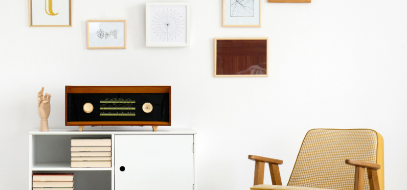
Vary the frames
Choosing different frame sizes, finishes and detailing can be another way to add visual interest. Try to balance the sizing by having one large anchor piece, a couple of medium sized artworks and a few more smaller pieces, and mix up the orientation between vertical and horizontal for a more curated look.
If you’re a little more reserved on the gallery wall front, start with choosing one finish like black framing, and mix the widths and sizes of the frames which will create the same impact without being overwhelming to a new designer.
